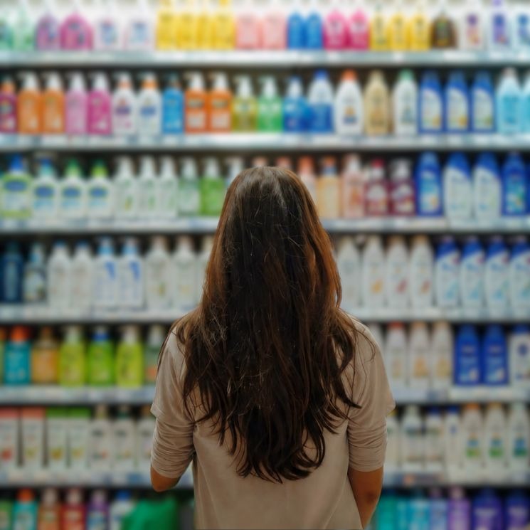
When consumers stand in front of a retail shelf, they are often presented with dozens of similar products competing for their attention.
In many cases, purchase decisions begin long before a consumer reads the product description or compares features. Packaging creates the first impression, influencing how a product is perceived within seconds.
For brands, this raises an important question: What do consumers actually notice first? Is it the shape of the package, its colour, the label design, or even the closure?
While the answer can vary depending on the product category and shopping environment, each packaging element plays a unique role in attracting attention and shaping consumer perception.
The First Few Seconds Matter
Shoppers often make quick decisions in busy retail environments. Before evaluating ingredients, functionality, or price, they respond to visual cues that help them identify products and compare options.
Packaging is one of the most influential of these cues.
Shape, colour, labels, and closures work together to create a product’s visual identity, but they do not all attract attention in the same way.
Shape: Often the First Visual Cue
The shape of a package is frequently one of the first elements consumers notice.
Unlike graphics or text, shape can be recognised from a distance. A unique bottle silhouette, distinctive jar profile, or recognisable container structure can help a product stand out even before consumers can read the label.
This is one reason many brands invest in custom packaging designs. A distinctive shape can support brand recognition and improve shelf visibility.
Shape can also influence perceptions of:
* Product quality
* Premium positioning
* Ease of use
* Product category recognition
In crowded categories, packaging shape often becomes the foundation of differentiation.
Colour: Capturing Attention Quickly
Once a product attracts attention through its shape, colour often becomes the next major influence.
Colour helps consumers navigate shelves and creates associations with particular product types or brand identities.
For example:
* Green is often associated with natural or wellness-focused products.
* Blue is commonly linked with freshness and hydration.
* Black is frequently used to communicate a premium look.
* Bright colours are often used to create energy and visibility.
Consistent colour usage can also strengthen brand recognition across product ranges.
The Role of Labels
While shape and colour may attract attention, labels often provide the information consumers need before making a purchase decision.
Labels communicate:
* Brand identity
* Product benefits
* Ingredients
* Usage information
* Regulatory requirements
An effective label balances visual appeal with clarity. Too much information can overwhelm consumers, while too little may leave important questions unanswered.
As transparency becomes increasingly important, labels continue to play a significant role in building consumer confidence.
Why Closures Matter More Than Many Brands Realise
Closures may not always be the first element consumers notice, but they contribute significantly to the overall product experience.
Consumers often associate closures with:
* Product quality
* Ease of use
* Freshness
* Convenience
* Reusability
In categories such as beverages, food, personal care, and home care products, closure selection can directly influence how consumers interact with a product throughout its lifecycle.
A well-designed closure supports functionality while complementing the overall packaging design.
Do Consumers Notice One Element More Than Others?
Rather than focusing on a single packaging feature, consumers generally respond to a combination of visual and functional elements.
In many cases:
Shape attracts attention.
Colour creates recognition.
Labels provide information and reassurance.
Closures influence usability and product experience.
The relative importance of each element depends on the product category, consumer expectations, and retail environment.
For example, a premium beverage may rely heavily on bottle shape and colour, while a nutritional supplement may depend more on label clarity and information.
What This Means for Brands
Packaging should not be viewed as a collection of individual components.
Shape, colour, labels, and closures work together to create a complete consumer experience. Decisions made during packaging development can influence shelf appeal, perceptions of quality, convenience, and overall brand value.
For brands launching new products or refreshing existing packaging, considering how these elements interact can help create a stronger market presence.
Looking Beyond Shelf Appeal
Modern packaging must balance visual impact with functionality, sustainability, and consumer convenience.
The most effective packaging solutions are often those that successfully combine all of these factors rather than focusing on a single design element.
Understanding how consumers interact with packaging can help brands make more informed packaging decisions while creating products that stand out in competitive markets.
Conclusion
When consumers encounter a product for the first time, packaging often shapes their perception long before they experience the product itself.
Shape, colour, labels, and closures each play a role in attracting attention, communicating value, and influencing purchasing decisions. While shape and colour may create the first impression, labels and closures help deliver the information and functionality consumers expect.
Successful packaging is rarely about a single element. It is about creating a packaging system where design, functionality, and consumer experience work together to support product success.